
Tears of The Kingdom is a fantastic game, filled with open exploration, endless experimentation, and deep systemic mechanics that manage to build off and exceed the groundwork laid by Breath of the Wild. And while they share a lot of the same building blocks, it would be a mistake to not acknowledge how different an experience Tears of The Kingdom is with its focus on player expression through creation.
Tears of The Kingdom wants players to spend their time inventing. Weapons that once broke quickly in BOTW now last longer by players binding them to materials. Missions include building bridges, boats, and planes to transport Hylians and Koroks to their destinations, along with building structures to prop up signs. Players have even built drones to beat up enemies and play the game for them. Nintendo has managed to create a game that left me feeling like I was an engineer.
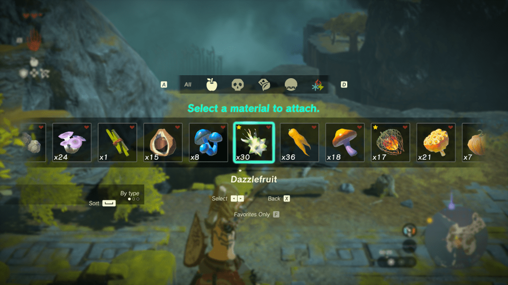
And to that end, there’s an increase in Link’s options in approaching archery. Instead of using one of four elemental arrows like in BOTW, Nintendo gives players over 200 unique items to bind to arrows with various surprising effects from increased range and auto-targeting to hypnotizing foes to summoning a swarm of bees. But I only experimented with a small fraction of these possibilities, because while Tears of The Kingdom offers an almost endless number of arrow fusions, the game doesn’t provide a User Interface that encourages this kind of exploration and expression.
Issues with Archery Fuse UI
I would argue there are a few things that keeps the arrow’s fuse UI from encouraging the gameplay that Nintendo wants players to experience:
- The lack of options to sort through the inventory or look at a subsection makes it difficult to find new or interesting objects to attach.
- Forcing players to hold a button to keep the menu open discourages searching the menu by causing hand fatigue (Nintendo Thumb strikes again!) and accidental menu closes. And it is unfriendly to players with accessibility concerns who may really struggle to keep their thumb on a small button.
- Not providing a way to tag specific items means players may forget some of the unique and interesting play styles over the course of a possibly 100 hour playthrough.
To challenge myself and ask the question “How could it be different?”, I decided to recreate the menu inside of Unity and then try some alternatives to see how it could impact how players approach archery in the game.
Link to GitHub code.
Recreation
Collecting Assets
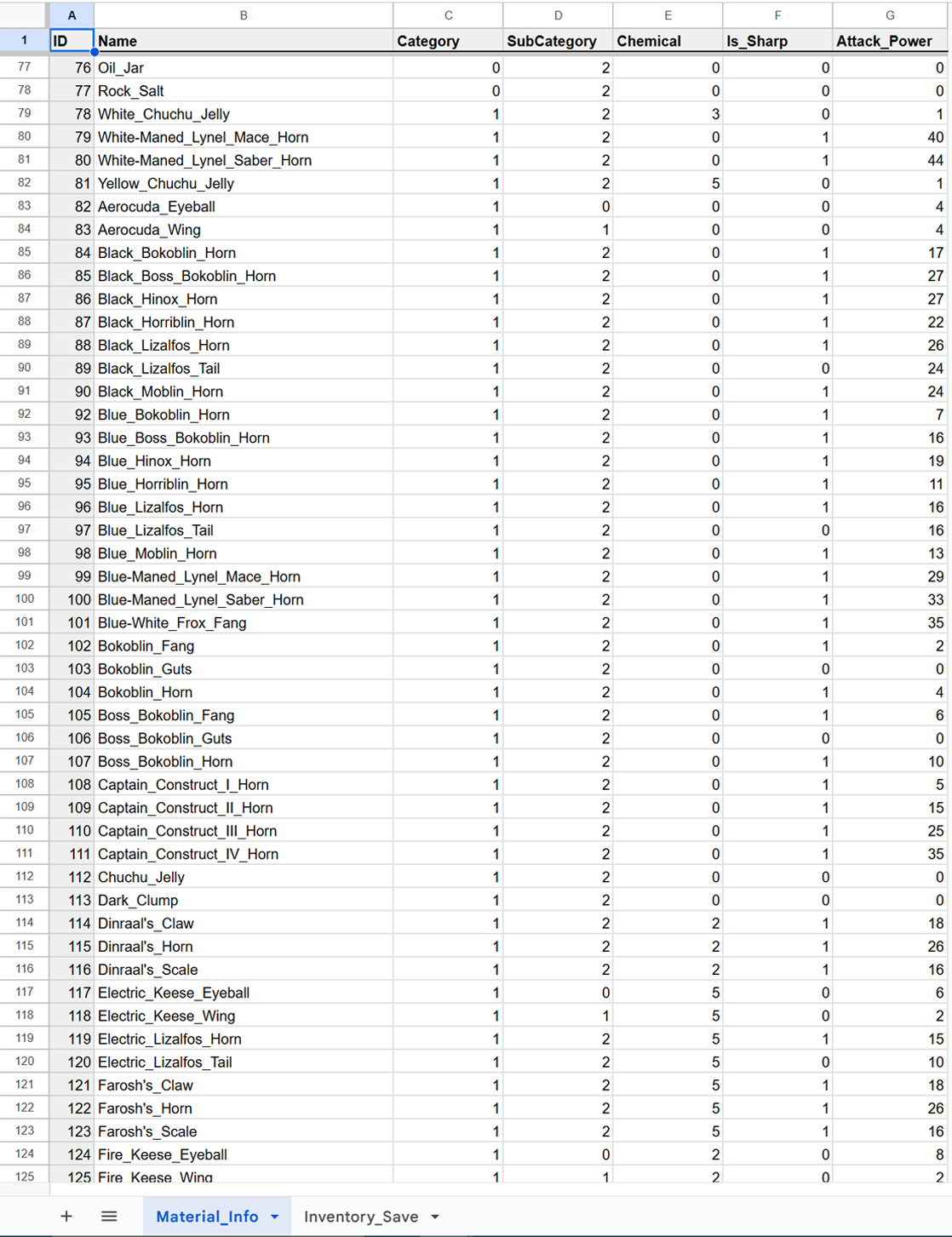
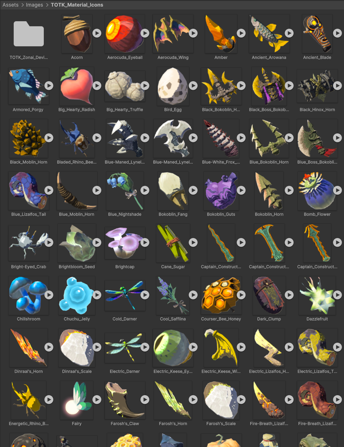
Before starting with code, it’s important to collect assets like images and sprites, fonts, and stats about items. Most of these are readily available online, though I did recreate the material and inventory data in a spreadsheet.
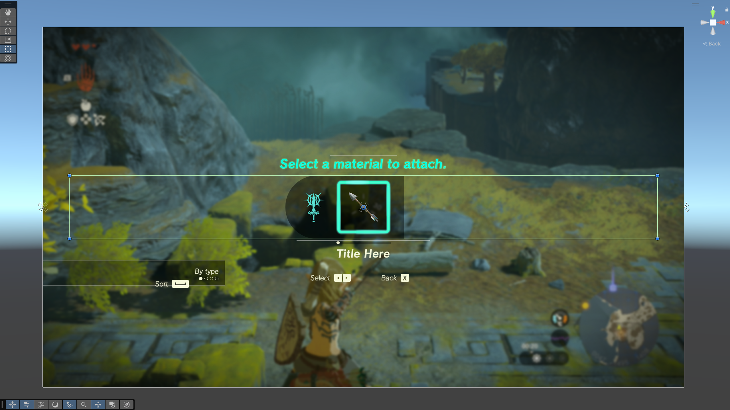
Setting Up UI
Using the game itself as reference, I setup the UI in Unity with layout groups, icons, and UI selectables to recreate the visuals and setup functionality to be as simple as possible later.

Functionality
With CSVHelper, we can read the material data spreadsheets and link them to assets like sprites.
By using the LINQ library, we can organize the material data as players would expect before spawning it in with prefabs for interactions.
Unity’s Input System provides a base for user inputs with some additional interactions, allowing for easy keyboard and controller support.
Lastly, DOTween adds some satisfying smooth motions as players scroll through the list.
Final Results – Recreation
Reimagination
Before starting to change existing design choices, I want to consider more deeply why I don’t think the menu is satisfactory as is. I stated that I thought the lack of options to sort through the inventory or look at a subsection makes it difficult to find new or interesting objects to attach. Looking beyond the default method, TotK gives three options for organizing:
- The “most used” option makes it easier for players to reuse items they’ve found useful. But it also discourages using new or more rare items as it’s impossible for these items to not be buried near the bottom of that list.
- The “Fuse attack power” option does help players find items that achieve their goals, but only through one avenue and ignores more unique play styles. Items with effects beyond damage yet again become buried in the list.
- The “Zonai devices” option provides the only way to actually shrink the list and showcases some of the more unique items.
This last option the game provides, I believe, hints at what I think would be an improvement. I plan to add two significant changes to the menu:
- A header bar, to give players the ability to shrink the list down by looking at different categories beyond just Zonai device. And that this categorizing will be independent of organizing the list by usage stats or attack power.
- A Favorites toggle, to enable looking exclusively at player favorited items, also independent of the sorting option or category selection.
Changes
Taking cues from the larger inventory system UI, I added a small menu bar of icons above the spawn list to represent the large categories items could be treated as.
I added a star icon in the upper left corner of inventory entries for favorited items.
I decided to break items into 3 major categories and then also included elemental items as an independent category due to how often players may want to search through those.
